If you were Stephen Wilde how would you have ranked them?
Here's how he lined them up.
If you were Stephen Wilde how would you have ranked them?
Here's how he lined them up.
i think # 1 and # 3 are awesome, cant say the same about the rest. # 3 would have taken my vote for first
black and white shots are dominating moneyshot07. im satisfied wth this weeks picks.
FAMILYBIKERIDE
I'm started to get fed up with all this b[HTML_REMOVED]w. Yeah, sure its artistic in some way, but latley it seems as you need to have a b[HTML_REMOVED]w pic to get a chance to win…
The last "Honourable mention" is quite boring.
And yeah, a bit dissapointed my own pic didn't get there…
I think in alot of cases b[HTML_REMOVED]w is the easy way out. In some cases it is better but alot of times its way over used.
Jamie
And yeah, a bit dissaponted my own pic didn't get there…
cause that photo isnt that good.
cause that photo isnt that good.
I'm just a bad looser then. ;)
The point was that next time i'm posting a b[HTML_REMOVED]w pic just for the thing…
Hey, cool, I was third!
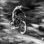
I took Stephen's suggestion, and made another version with more contrast: http://photos.nsmb.com/showimage.php?i=13881[HTML_REMOVED]c=5. I should've done that in the first place - I definitely like it better this way!
Congrats to the other photographers, and I especially like #1!
I think the 2nd and 4th photos would have been stronger contenders if they were a bit more pulled out and showed where they were going to land or what the scenery was like around them a bit more.

Well, I got an honourable mention (which is all I ever aspired to) so I'm totally stoked.
Even though I know that Stepehn only picked that one 'cause he's got the hots for Barb.
I totally agree with the winner. The compostion of that shot is so cool. The way the rider is facing, the trees all pulling your vision to weird corners of the shot, its really neat. With all the details in there, I don't think it would have worked in colour either.
I hear ya on the B[HTML_REMOVED]W thing though, but with a sport that takes place in the forest a lot of times you have to shoot in B[HTML_REMOVED]W or you get nuthin.
Overall, I thought that the entries for week five were a little on the weaker side compared to the previous weeks, but I'm still surprised to not see any of RunG's shots mentioned this week. He might get a bit heavy handed on the Photoshop from time to time, but he's taking some really good stuff.

37 YEARS ON THE BIKE :: 1981-2018
Keep it up Rene.
Some great shots in your file!
I love the winning shot this week, the tree's in the background are so cool but still don't distract from the subject. I completely disagree with the "black and white is the easy way out" thing. Sometimes black and white improves a picture, but if it doesn't add anything to the shot then there is no reason for it to be b+w. The trick seems to be figuring out when to use it. IMO, the winner this week figured that out pretty good.
Forum jump: