New posts

Confused about contrast

May 19, 2014, 10:39 p.m.
Posts: 2906
Joined: June 15, 2006

When should I be adding/removing contrast in Lightroom?

In the past I have generally added contrast to make photos "pop", but I took some shots this weekend then when I set a minus contrast, I felt like it really worked to help brighten up the scene. Is this cheating? Is there another / better method?

How do you know when to add or remove…or should I just go with my gut, and how I like the photo in LR?

Original:

+75 contrast:

-85 contrast:

This trip to Kelowna was definately an undertaking - Liam and I had been planning this project for 24 hours. We worked really hard to pull out all the stops in this video. We had slo-mo goggle shots; time lapses; pedal flips; outrageous product shots; unloading and loading the bike; walking through the field with your hand in wheat. At the end of the day this trip was all about just getting out and riding with all my friends.

www.letsridebikes.ca

May 19, 2014, 11:08 p.m.
Posts: 4295
Joined: June 24, 2010

Everything in moderation. Both of those options look way over-processed.

I generally only use the contrast slider in the positive direction, and usually within 25-40 points of where it started out (in my version of LR, with RAW files, that's +25).

What are you hoping to accomplish with negative contrast?

flickr

May 19, 2014, 11:12 p.m.
Posts: 2906
Joined: June 15, 2006

What are you hoping to accomplish with negative contrast?

Thanks for your input Morgan.

I felt like the negative contrast injected light into the photo..even though it was sunny, there was a lot of shade. Rather than use the Shadow or Black slider, I could accomplish brightening of faces and features (like the ferns) with negative contrast.

This trip to Kelowna was definately an undertaking - Liam and I had been planning this project for 24 hours. We worked really hard to pull out all the stops in this video. We had slo-mo goggle shots; time lapses; pedal flips; outrageous product shots; unloading and loading the bike; walking through the field with your hand in wheat. At the end of the day this trip was all about just getting out and riding with all my friends.

www.letsridebikes.ca

May 19, 2014, 11:32 p.m.
Posts: 4295
Joined: June 24, 2010

Try using fill light (max +20) with a bit of positive contrast and possibly some exposure (between -1.00 and +1.00 depending on the original image, in this case probably positive).

flickr

May 20, 2014, 7:51 a.m.
Posts: 11969
Joined: June 4, 2008

If you are shooting in RAW, you'll more than likely need to add a bit of contrast. If you are shooting in JPG, a predetermined amount is already being added for you. Its dependent upon a whole range of things which means there is no clear-cut answer as to how much you should use.

Think of contrast as removing unwanted detail in order to highlight some other aspect of the photo. Your second picture loses detail in the shadows and the light areas.

One of the nice things about Photoshop is to be able to use the Curves function to selectively target the type of contrast you want such as only losing detail in the shadows, but keeping the lighter aspects of the photo the same.

(I just googled "Lightroom Curves" and it looks like you have something along the same lines, give it a look!)

May 20, 2014, 2:21 p.m.
Posts: 3183
Joined: Dec. 19, 2002

Know your histogram yo!

www.tuchiwsky.com

May 20, 2014, 2:54 p.m.
Posts: 191
Joined: Aug. 21, 2013

The Lightroom curves are easy to use (okay I'll admit, I only have experience with LR curves). When you put your cursor over a certain point it will tell you what you are sdjusting (Highlights, lights, darks, shadows etc). Try it out, play around with some existing photos (you might want to create virtual copies for that)


:japan:

May 20, 2014, 3:54 p.m.
Posts: 2906
Joined: June 15, 2006

Know your histogram yo!

I've heard that before, but don't even know where to start..

This trip to Kelowna was definately an undertaking - Liam and I had been planning this project for 24 hours. We worked really hard to pull out all the stops in this video. We had slo-mo goggle shots; time lapses; pedal flips; outrageous product shots; unloading and loading the bike; walking through the field with your hand in wheat. At the end of the day this trip was all about just getting out and riding with all my friends.

www.letsridebikes.ca

May 21, 2014, 1:41 p.m.
Posts: 191
Joined: Aug. 21, 2013

Let's start with what "histogram" means in the non-photo world.

A histogram is a graphical/visual representation of a set of data. For example, if you made a survey of riders on Fromme and what size bikes they ride, you could come up with a set of data like this, then turn it into a histogram it would look like:


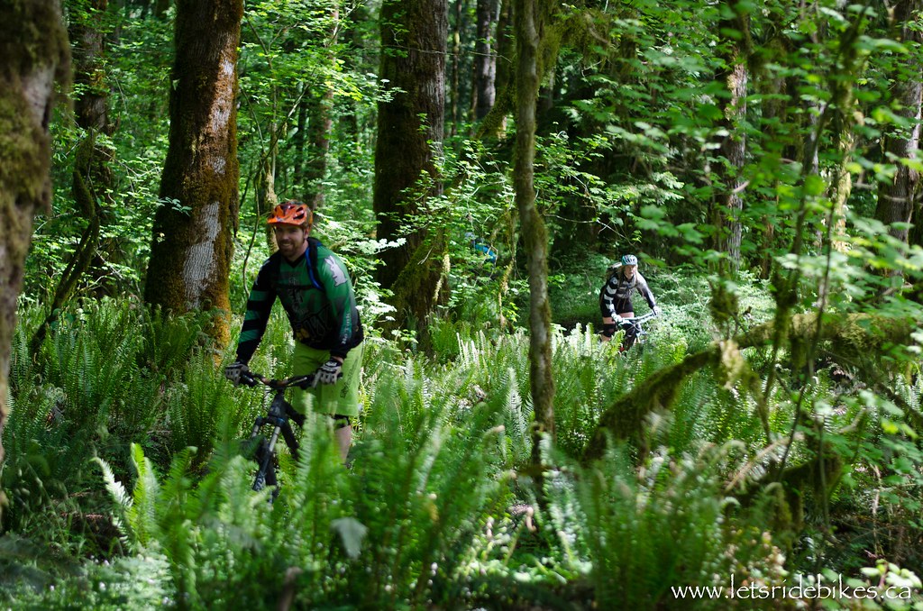
Now let's do a "survey" of a photo.
Instead of "bike size" you would have something like "light range", while "frequency" (how much of something you have) would stay the same (in any histogram, frequency is always there but what you are plotting frequency against will change). Under "light range" you would have Blacks, Shadows, Exposure, Highlights and Whites. Now if we plot it out, you would have on the x-axis (bottom): Exposure in the middle, as they are your mid-tones, then Highlights to the right, your "upper" mid-tones, then to the right of that, your Whites. To the left of the Exposure/mid-tones, you have shadows, your "lower" mid-tones. And finally to the left of that you have your Blacks.
Now once you plot it out against the frequency, ie how much blacks do you have, how much shadows, whites, etc, you end up with a histogram.

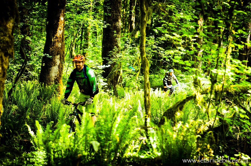
Here's a simplified "photo" histogram. A photo that would create this histogram would be on the dark side of things, with some "neutral" areas. You can see there are a lot of Blacks and shadows, whereas there are almost zero highlights and whites


This histogram tells me I have a lot going on in the Blacks (left-most) and the Whites (right-most), but not so much of the mid-tones area (Shadows, Exposure and Highlights). If you look at the actual photo, you can see it has a lot of bright whites in the background, some very dark spots, the Blacks, in the clips, and very few mid-tones. The histogram takes this information and creates a graph out of it.


Now take a look at this photo. You can see that there are no bright (whites) spots, and the back of the grill is very dark, in this case it is clipping. The detail in the food is not lost through clipping, and there are some "lower mid-tones". If you look at the histogram, it shows you that there are a lot of Blacks (back of the grill, lower right corner), some shadows (on the food, bottom of the grill), a small bump in the mid-tones (the food), and the Highlights and Whites are basically non-existant in this photo.

Now let's take a look at the tone curve for the grill photo

The line represents where things are at right now. When you push a section of the curve up, it makes that section brighter, when you push it down, darker.


Now for this photo, I've made everything brighter, since the whole photo was leaning towards the Blacks. You can see that the food has started clipping, the lower right corner wasn't too dark so there is a little recovery in it (it was classified as "Shadows")…but the back is still clipping. Nothing I can do about that, it was way too dark when I first took the photo anyways. (By the way, I wouldn't publish a photo that looks like the way I edited it. It is in no way complete).


:japan:

May 21, 2014, 2:19 p.m.
Posts: 2906
Joined: June 15, 2006

Fack, now I'm hungry. Thanks Kaz.

This trip to Kelowna was definately an undertaking - Liam and I had been planning this project for 24 hours. We worked really hard to pull out all the stops in this video. We had slo-mo goggle shots; time lapses; pedal flips; outrageous product shots; unloading and loading the bike; walking through the field with your hand in wheat. At the end of the day this trip was all about just getting out and riding with all my friends.

www.letsridebikes.ca

May 21, 2014, 8:24 p.m.
Posts: 3
Joined: Aug. 12, 2006

Detail in the highlights, detail in the shadows. Mid tones in between. That should be your goal Often adjusting the image contrast alone creates too much of a global setting right across the one of the image and is not selective enough. The preset is generally too high for my liking. Notice how the shadows open up when you decrease the contrast. So to increase the contrast of the image you can adjust the shadows upward and decrease the black point. This has the advantage of leaving the highlights where you want them to be and not washing them out.

May 21, 2014, 9:09 p.m.
Posts: 15019
Joined: April 5, 2007

Wut?

Doesn't everyone just instagram now?

Why slag free swag?:rolleyes:

ummm, as your doctor i recommend against riding with a scaphoid fracture.

May 22, 2014, 9:05 a.m.
Posts: 4295
Joined: June 24, 2010

Fuck histograms, just do what feels right. Kaz, how do your crushed browns show up on the histogram?

flickr

May 22, 2014, 9:24 a.m.
Posts: 160
Joined: Nov. 19, 2002

Fuck histograms, just do what feels right.

bingo

May 22, 2014, 10:57 a.m.
Posts: 191
Joined: Aug. 21, 2013

Fuck histograms, just do what feels right. Kaz, how do your crushed browns show up on the histogram?

0 blacks 0 whites

I actually don't use the histogram either, I just know what it is. I tried using just the histogram to edit a photo once, it ended up looking like crap


:japan:

Forum jump: