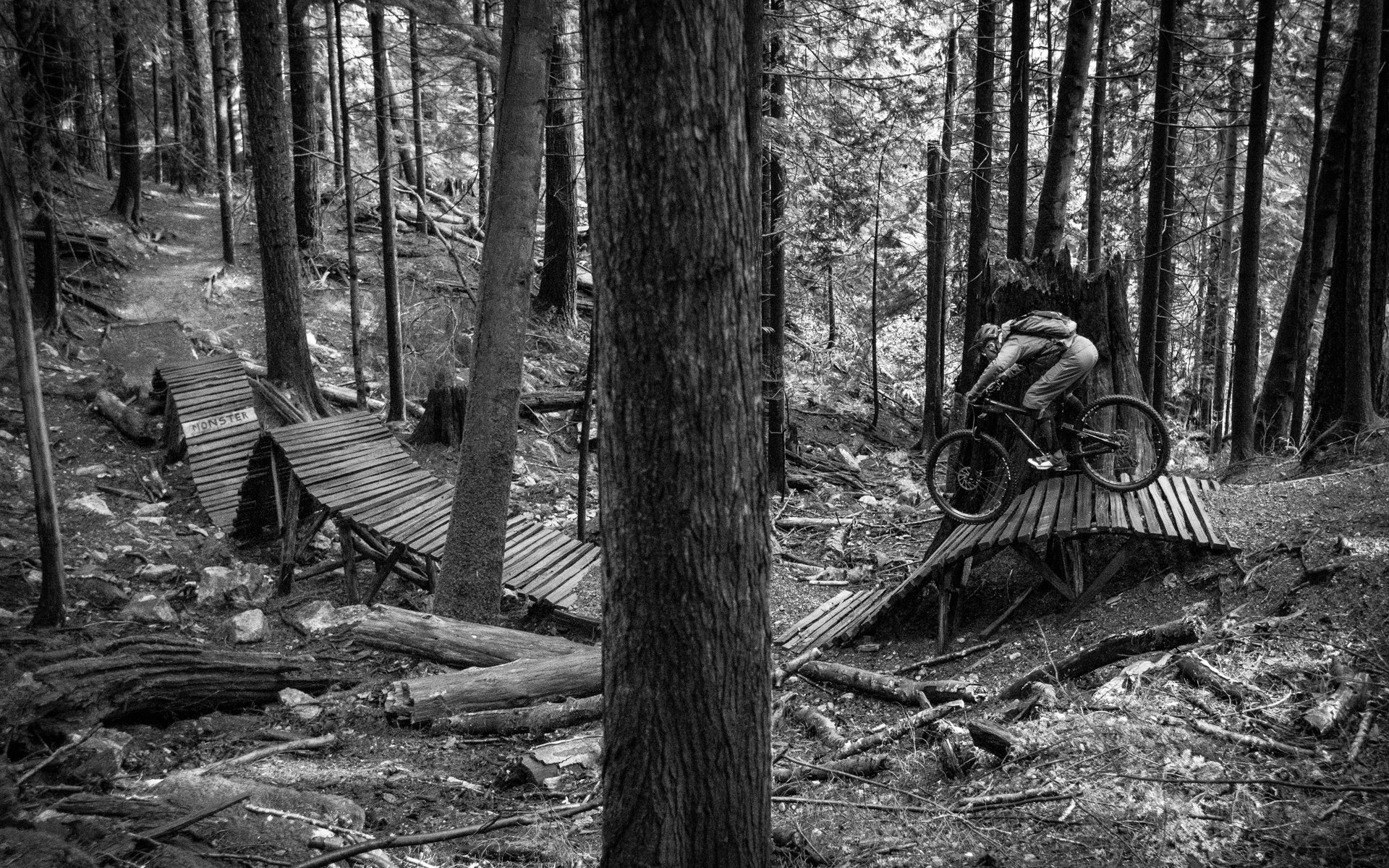
IT'S A BETA
NSMB V4.0
We know. The NSMB you were used to fit like an old glove. Worn in nicely. No longer clean and fresh, but...comfortable. Sometimes you don't realize your fingertips are freezing and you keep sticking them in your armpits to keep them warm.
Then you're left with fingers that smell like armpits.
We've seen a lot of change since we turned the lights on in the summer of 2000. Back then, there was no source of local MTB news here on the North Shore. Northshoremountainbiking.com was supposed to be a print mag, initially. If we've learned anything, it's that typos are easier to fix online. We're still better at typos than we are at fixing them. That's with 17 years of practice, too.
Our new site doesn't just smell better, it looks a lot better, too. Try it on your phone. Nice, huh? And now, when you sign in to do one thing - like comment on how crappy this article is - you'll use that same account to troll someone on the forum or list your 26" bike on our new Buy n Sell (coming soon!). Just kidding - keep your 26" bike because you probably can't sell it anyway.
In the very near future, we'll have more improvements to share, some of which aren't as obvious as 'comments section that allows comments' or 'links click through'. For real, though, we have some cool stuff planned. You might even believe us when we say we've been staying up late and even skipping the odd #flaskfriday ride (that happened once but we still had flasks). Meanwhile, we know things aren't working perfectly. Just like your new bike needs a few rides to get dialed, we're going to need a few days (plus a few more) to get things straightened out. Please bear with us until then. Leave us a comment on the forum if something's broken. Or under this article. Except comments are broken. (Edit: they're fixed!)
Yep, our old site was worn down like a rear tire on a rental bike. And although the scenery has changed, some other things haven't. We'll still tell it like it is. We won't ever be perfect. And we promise to always have fun doing it. Hopefully, we won't be the only ones.





Comments
Pete Roggeman
7 years, 1 month ago
Comments are working again, so please let us know what you think.
Reply
Sven Luebke
7 years, 1 month ago
welcome back! its awesome to be able to comment on articles without discus
Reply
earl
7 years, 1 month ago
I'm liking this new updated look for the site Team NSMB , keep it coming. Enjoy the way the search function brings up the links to all my old stuff from the past. You can't hide from the internet! Cheers, Malcolm
Reply
pedalhound
7 years, 1 month ago
Love the one sign in.
Nice to see the top nav bar change happen so fast, Thank you!
I notice not many people are really using the forums yet, maybe because their old bookmark is sending to the old forum or because of the sign in issues...but I just thought it was interesting. The forum name for the bookmark is set to Machina...may want to change that. Would also love to see a quick post feature...less clicking = gooder. I would love there to be a darker option for the forums, I find the white and light blue hard to read as well. I think photo's look better on a darker background too...so a totally selfish ask...lol.
The site is kinda slow to load, especially for the forums.
Is it possible to change my account name? I would love to use my real name.
Overall, I love the design, clean, and responsive! Keep up the good work NSMB.com team! Can't wait to see what you have in store for the site.
Reply
pedalhound
7 years, 1 month ago
Also, in the forums it's hard to tell what posts are new since the users last visit. It would be nice to have a colour difference between posts I have read and posts I have not...or some way to make it easier to see what's new and what's not.
Reply
Cam McRae
7 years, 1 month ago
Pretty sure we can change your name. Just send me an email.
Reply
pedalhound
7 years, 1 month ago
Will do, thanks Cam.
Reply
norman
7 years, 1 month ago
I've pushed some optimizations out so the speed should be much better now. Let me know if it's still laggy.
Reply
Tuskaloosa
7 years, 1 month ago
4th time lucky...
I must admit I kinda liked the old layout but then it won't be long before this layout grows on me.
Keep on improving guys well done
Reply
Sven Luebke
7 years, 1 month ago
Awe, these are the same comment synchro made in 2008 😗
ohh! smileys work!
Reply
WNCmotard
7 years, 1 month ago
I kinda miss the old layout. Then again, I'm a known luddite.
Reply
Vik Banerjee
7 years, 1 month ago
The old site displays better on my bigger monitors on the desktop. When I open the new site the main image takes over the whole screen and I don't see anything else.
On smaller devices the new site is better than on the desktop, but for some reason the main image/sliding articles at the top fails to load.
I don't care about the old site specifically, but it was easier to use/better laid out.
Reply
normantan
7 years, 1 month ago
How big a resolution are you running Vik?
Reply
Vik Banerjee
7 years, 1 month ago
1920 x 1080
Here are screen captures of NSMB, Bike Mag, Flow and PB so you can see the difference.
https://c2.staticflickr.com/4/3852/32397743243_74dcfae0b4_o.png
https://c2.staticflickr.com/4/3709/33055832002_6579a8851d_o.png
https://c2.staticflickr.com/4/3919/32397797333_5e5174f2e0_o.png
https://c1.staticflickr.com/1/641/33212649045_a79c2341ab_o.png
Of these 4 I like the Flow layout the best. I can see a lot on the opening screen without having to scroll a ton. It's clean and efficient for what it is.
Reply
Cam McRae
7 years, 1 month ago
Comments! Hooray!
I'm sure it's possible to have the bar disappear at the appropriate times. Lots of tweaks to come and we'll look into that one for sure. Thanks for the feedback!
Reply
rckwng
7 years, 1 month ago
While I loved the old site for it's simplicity and familiarity, the new site is a nice update.
My main suggestion is to change the font to something that isn't condensed, or at least increase the letter spacing (aka tracking) so it's easier to read. My aging eyes find long articles tiring and hard to read. The leading in the articles could also be reduced to reduce the amount of scrolling a reader has to do (more like the leading here in the Comments section).
Keep up the great work!
Reply
Luix
7 years, 1 month ago
I'm not entirely sold for the new tablet-friendly layout (it sucks in PCs and laptops), but the whiter background is certainly refreshing.
Oh, and where did you hide Uncle Dave? We haven't had our Davey fix in a while, and the crave is growing stronger with every new day!
Reply
Mic
7 years, 1 month ago
I really like the idea of the one log-in.
I was so used to the old forum that it might take a few days to get used to this new, hopefully more awesome nsmb.
I just "repped" a comment and afterwards I was automatically send to the very top. Is this normal, can it be changed? Or maybe I am too stupid to use the arrows? I am not the brightest internet user.
Reply
norman
7 years, 1 month ago
It's a bug. Will fix!
Reply
flatch
7 years, 1 month ago
repped??? how the hell did you do that?
Reply
Mic
7 years, 1 month ago
When you are logged in there are two blue arrows below your avatar. Up or down.
Reply
flatch
7 years, 1 month ago
when in the forum those arrows are gone
Reply
flatch
7 years, 1 month ago
I also notice even when logged in my avatar has no arrows.
Reply
cxfahrer
7 years, 1 month ago
I don´t mind the new layout, but the old worked fine. At one glance all new themes.
Is it possible to remove or downsize that big black bar on top of the page? I always have to scroll (tablet and pc) down to see the full screen of the fotos.
Reply
normantan
7 years, 1 month ago
Yeap! I've just pushed out a change that will shrink down the blackbar up top. You might have to refresh to see it, but that should make things better.
Reply
Jan Dvořák
7 years, 1 month ago
Why is it showing the mobile version when I load it on my desktop?! Jokes aside... The new site is good for mobile and touch devices with screens up to 10 inches. For PCs it's trash. :(
Reply
Jan Dvořák
7 years, 1 month ago
Forgot to say that the old site was very good for viewing on PCs.
Reply
norman
7 years, 1 month ago
Thanks for the comments Jan. We're going to revamp the nav.
Reply
normantan
7 years, 1 month ago
What specifically is bothering you on PC?
Reply
mak
7 years, 1 month ago
the hidden flyout menu, pain to have to click to reveal, on a PC it should be visible, OK on small phone etc where real eastate is low, but hate it on PC versions of sites - a no no on web design really
also the shrinking top bar, again I think its a no no to have things jumping about, just make it smaller or fixed size would be better - c
Cheers
Reply
Jan Dvořák
7 years, 1 month ago
When I open the site I see one BIIIIG picture with an arcticle, when I scroll down I see articles listed in two columns and a lot of white unused space. Basically I see not enough content for the dimensions of space it is on. And also the hidden menu is annoying as hell on big screens.
Reply
lowerdev
7 years, 1 month ago
I totally agree with what mak and Jan Dvořák have to say.
The hamburger menu in the top left is great for mobile devices but really inconvenient on bigger displays. There is a lot of space that can be used and not all that many navigational links in the menu so I think it's perfect to display it as a navigation bar.
Also the layout could be made to show more content at once. The webpage doesn't really scale to larger resolutions either sticking to a wrapper of 940px wide could be easily translated to wider screens to fit more columns without much css code at all.
Sincerely
Reply
DeereJay
7 years, 1 month ago
Haven't much toured through the new layout yet, but I certainly like what I see so far. I can agree with a few of the posters about the opening page being large and cumbersome on PC, but feel it's not bad enough to allow me to complain about it.
Thanks team!
Reply
flatch
7 years, 1 month ago
not happy with the new forum at all. Never felt so out of touch. Can't figure out a thing. Simple is always best and this new format seems far from simple. Some prompts or direction would be cool.
Reply
Please log in to leave a comment.